Logo Design Showcase
This collection highlights a range of recent and favorite logo designs created for a diverse client base—including small family-owned businesses, mid-sized companies, large corporations, and local city and state government agencies.
Each logo is thoughtfully crafted with the client’s unique identity, audience, and application in mind. Rather than relying on a single visual style, my approach focuses on solving the specific visual communication challenge at hand—whether the logo needs to stand out on packaging, communicate trust at a civic level, or scale seamlessly across digital and print.
I believe a successful logo is not just visually appealing—it’s purposeful, versatile, and rooted in strategy. This showcase represents my commitment to delivering distinctive, meaningful brand marks that adapt to real-world use and leave a lasting impression.
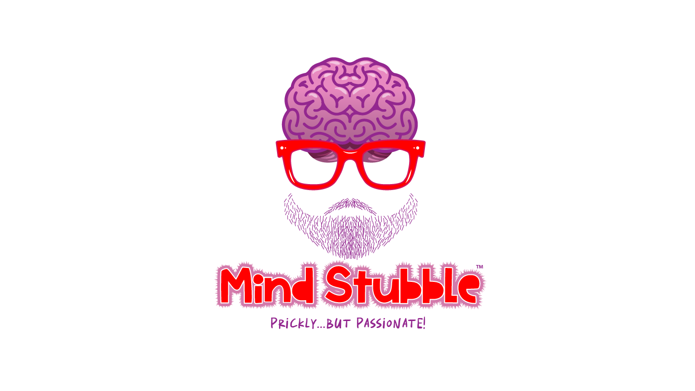
Mind Stubble Logo Design
The Mind Stubble logo was created for a client launching a Substack blog with a libertarian-leaning perspective. The goal was to develop a distinctive wordmark paired with a versatile icon—each able to stand alone or work together seamlessly across digital platforms, including social media avatars. Designed with future brand expansion in mind, the identity balances an approachable, lighthearted appearance with a strategic adaptability, and a strong visual voice.

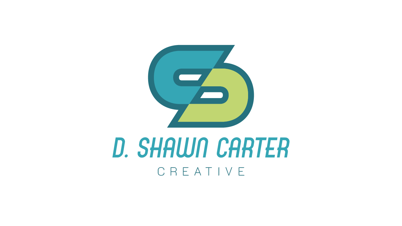
Personal Identity Logo
Designing for yourself is often the toughest client. This logo combines my initials, D and C, into a continuous, ribbon-like form—symbolizing the integrated, end-to-end nature of my creative services. It reflects a modern, adaptive approach to branding, where strategy, design, and execution are seamlessly connected.
Personal Logo Concept – DC/S Monogram
This alternate personal logo explores a monogram that merges the initials D and C to subtly form an S, referencing my middle name. The result is a bold, simplified mark with a strong, athletic aesthetic—ideal for lifestyle or apparel applications. While visually striking, I ultimately set it aside to pursue a direction that better aligned with my brand positioning and target clientele.
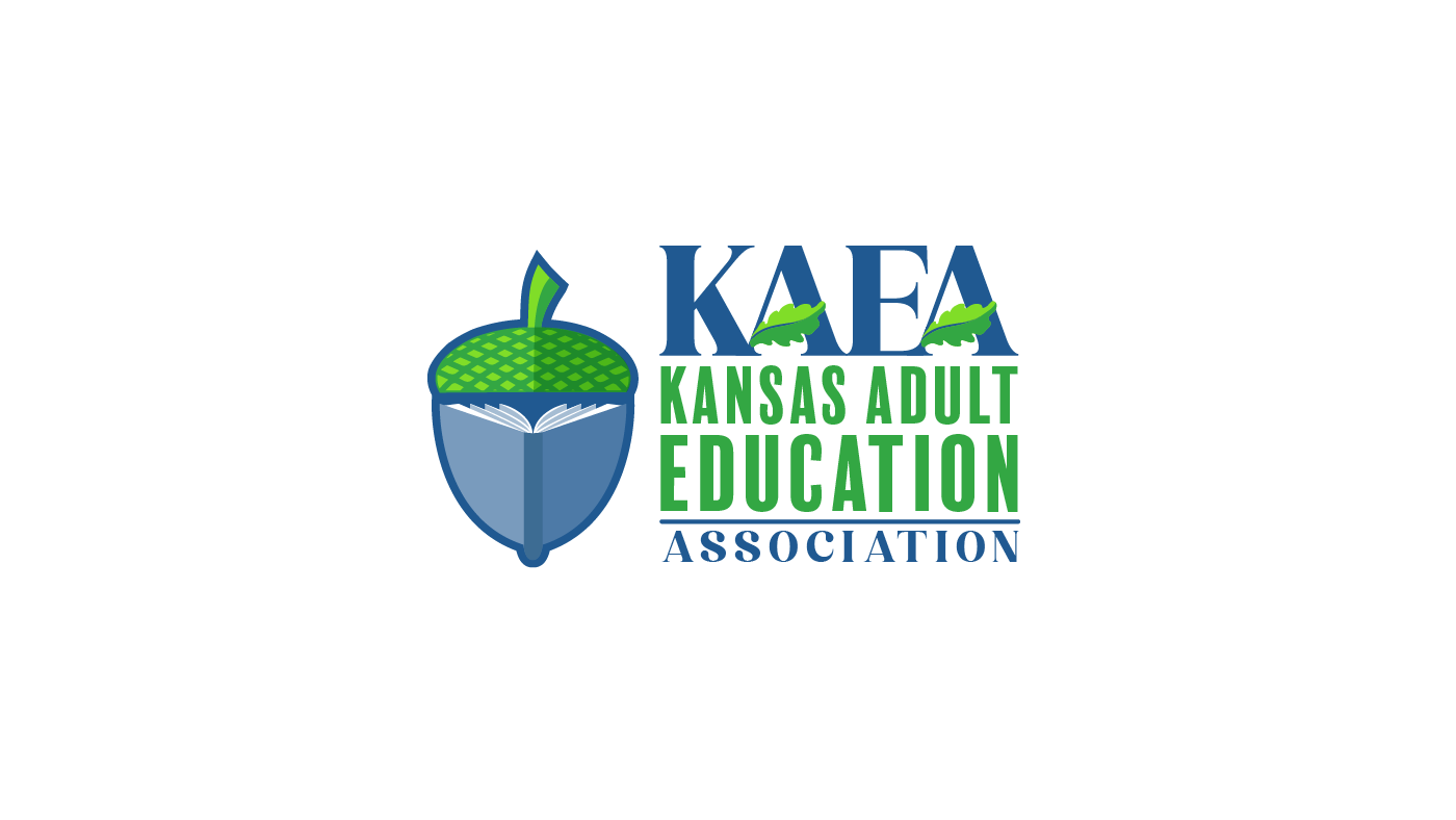
Client: Kansas Adult Education Association – Brand Identity Concept
Following my ongoing collaboration with the Kansas Board of Regents, I was approached by the administrator of another state-run program seeking a new brand identity—initially driven by the need to rebuild their website. I led a team of Cox Media designers through the creative process and contributed my own logo concept for consideration. While my design wasn’t ultimately selected, the experience remains a recent favorite thanks to the strong collaboration on both sides and the opportunity to push thoughtful design for a meaningful public initiative.

Client: Kansas Board of Regents, Career Technical Education Program – Brand Identity
While at Cox Media, I developed a visual identity for the Kansas Board of Regents’ new Career Technical Education initiative. Tasked with aligning the brand closely to the existing KBOR identity, I retained key typography and the original color palette while introducing gear and agriculture-inspired elements to reflect the program’s focus on skilled trades and career-readiness pathways.
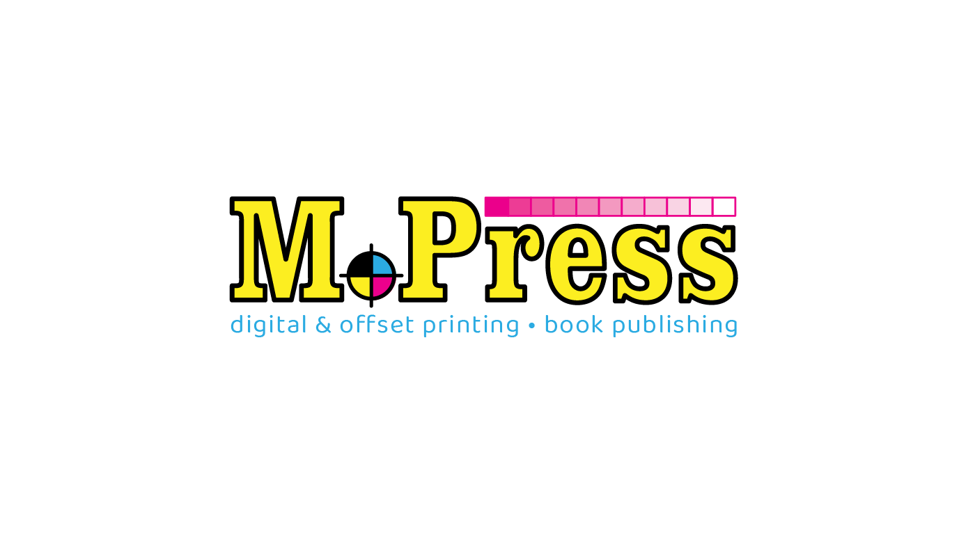
Client: Mennonite Press – Brand Exploration
While at Mennonite Press, I was tasked with exploring a full rebrand for the century-old company. Leadership sought to modernize the brand and address concerns that the name “Mennonite” might limit broader market appeal. The initiative also included developing a distinct identity for a new retail location offering copy, design, and signage services—separate from the legacy publishing and offset printing business.
Client: Mennonite Press – Retail Brand Development
As part of the larger Mennonite Press rebrand, this project focused on creating a distinct identity for a new walk-in retail location in Newton, Kansas. Offering copy services, design support, signage, and apparel printing, the brand was developed as a companion to M.Press, with its own name, visual language, and positioning to serve a local, consumer-facing audience. This was a full-scope branding initiative, from concept to implementation.
Client: Eric Carroll – Platform Inc. Brand Identity
Platform Inc. is a metal fabrication studio offering design, manufacturing, and plasma cutting services. The client sought a bold, versatile identity that wouldn’t limit future growth or tie too closely to current offerings. The final mark delivers strong visual presence without being industry-specific, subtly integrating a merged T and F to form a caliper-inspired shape—suggestive of precision, without being overt.
Client: Eric Carroll – Desert Steel Brand Identity
I created the original brand identity for Desert Steel Company as artist Eric Carroll was introducing his hand-crafted steel cacti sculptures to the fine art market. The logo was designed to resemble a single piece of laser-cut steel, with a raw, patina-inspired aesthetic that translated cleanly into one-color applications. A supporting palette of orange and purple echoed the dramatic tones of the desert Southwest, aligning the visual identity with the brand’s artistic roots and geographic inspiration.
Client: Eric Carroll – Arizona Cactus Factory Brand Identity
As Eric Carroll expanded his fine art cactus sculptures into a retail product line, he launched Arizona Cactus Factory to appeal to national retailers. He needed a distinct brand identity that would resonate in commercial settings while visually representing the product itself. I created a logo that incorporated a stylized cactus form, giving the brand an immediate connection to the artwork and its desert inspiration—positioning it for broader retail appeal.
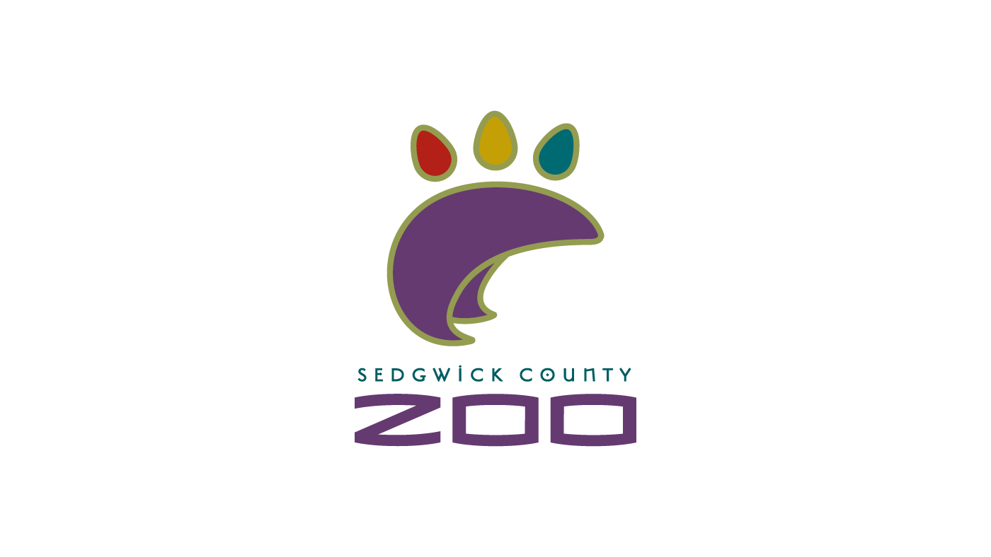
Client: Sedgwick County Zoo – Brand Redesign
As part of a full rebrand for the Sedgwick County Zoo, this project was one of the most comprehensive initiatives I designed at Tony Blake Design. Backed by in-depth research and multiple concept directions, the Zoo sought a modern, digitally adaptable identity—one not tied to a single animal, but instantly recognizable and versatile across platforms. The evolving digital landscape allowed us to move beyond traditional two-color limitations and explore a more dynamic, brand-forward solution.
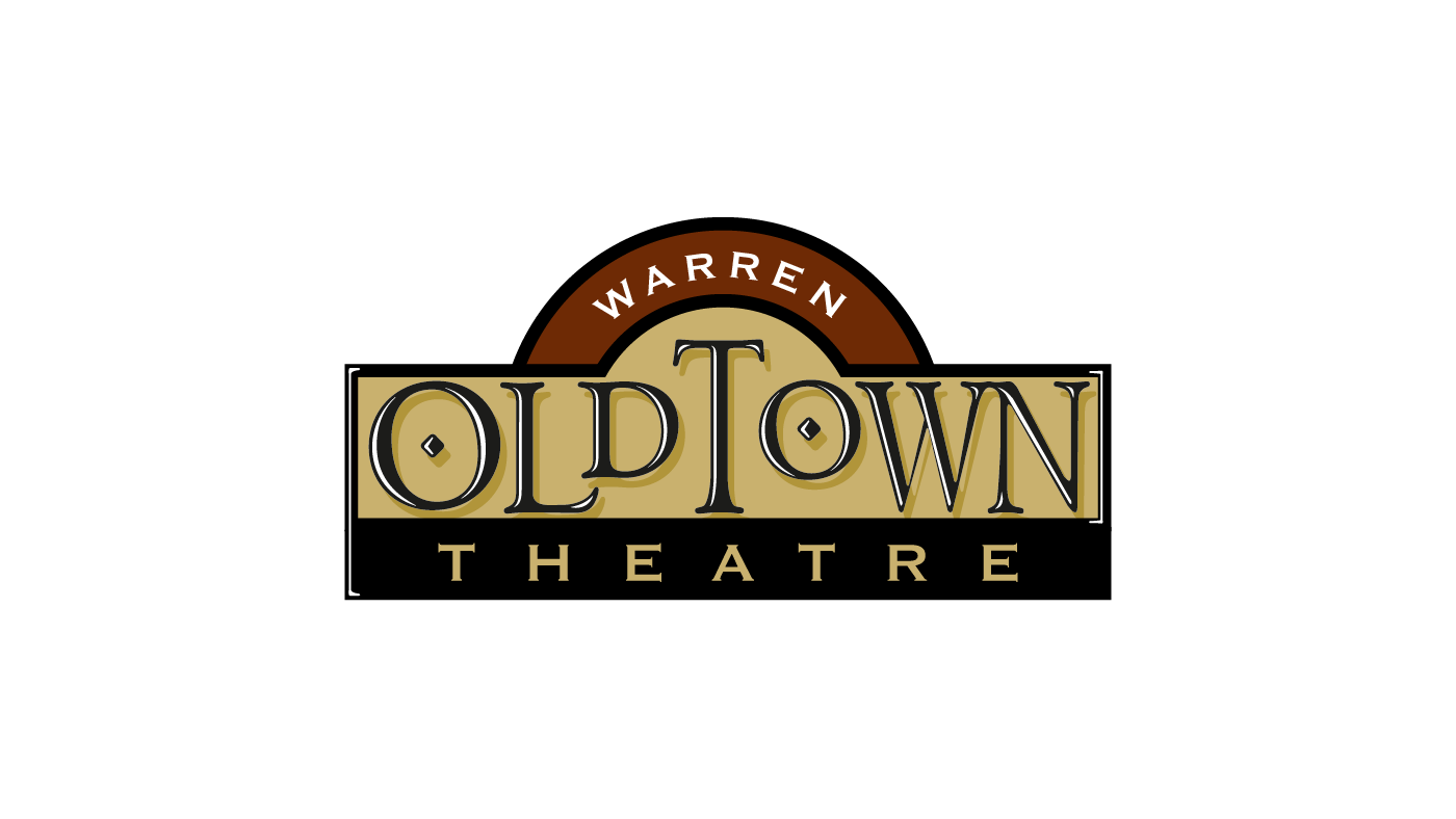
Client: Bill Warren – Old Town Theatre Brand Identity
While at Tony Blake Design, I served as lead designer for the branding of Bill Warren’s Old Town Theatre in Wichita, Kansas—an innovative cinema and sports bar concept set within the city’s historic Victorian-era "Old Town" warehouse district. The goal was to create a distinctive identity that stood apart from Warren’s other theaters while capturing the charm and character of the Old Town setting through a refined, period-inspired design.
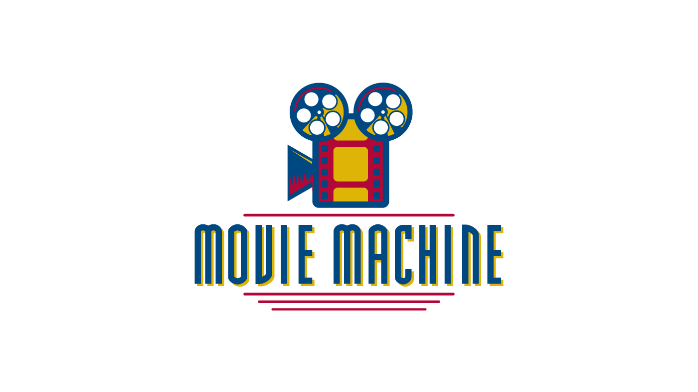
Client: Bill Warren – Movie Machine Brand Identity
Movie Machine was a second-run multiplex located in Towne West Mall, designed to appeal to a younger, budget-conscious audience. While leading the project at Tony Blake Design, I developed a playful, retro-inspired brand identity with bold colors and energetic visual elements—distinct from Warren’s premium first-run theaters, yet aligned with the overall brand family. The work extended into interior design to create a cohesive, youth-focused entertainment experience.
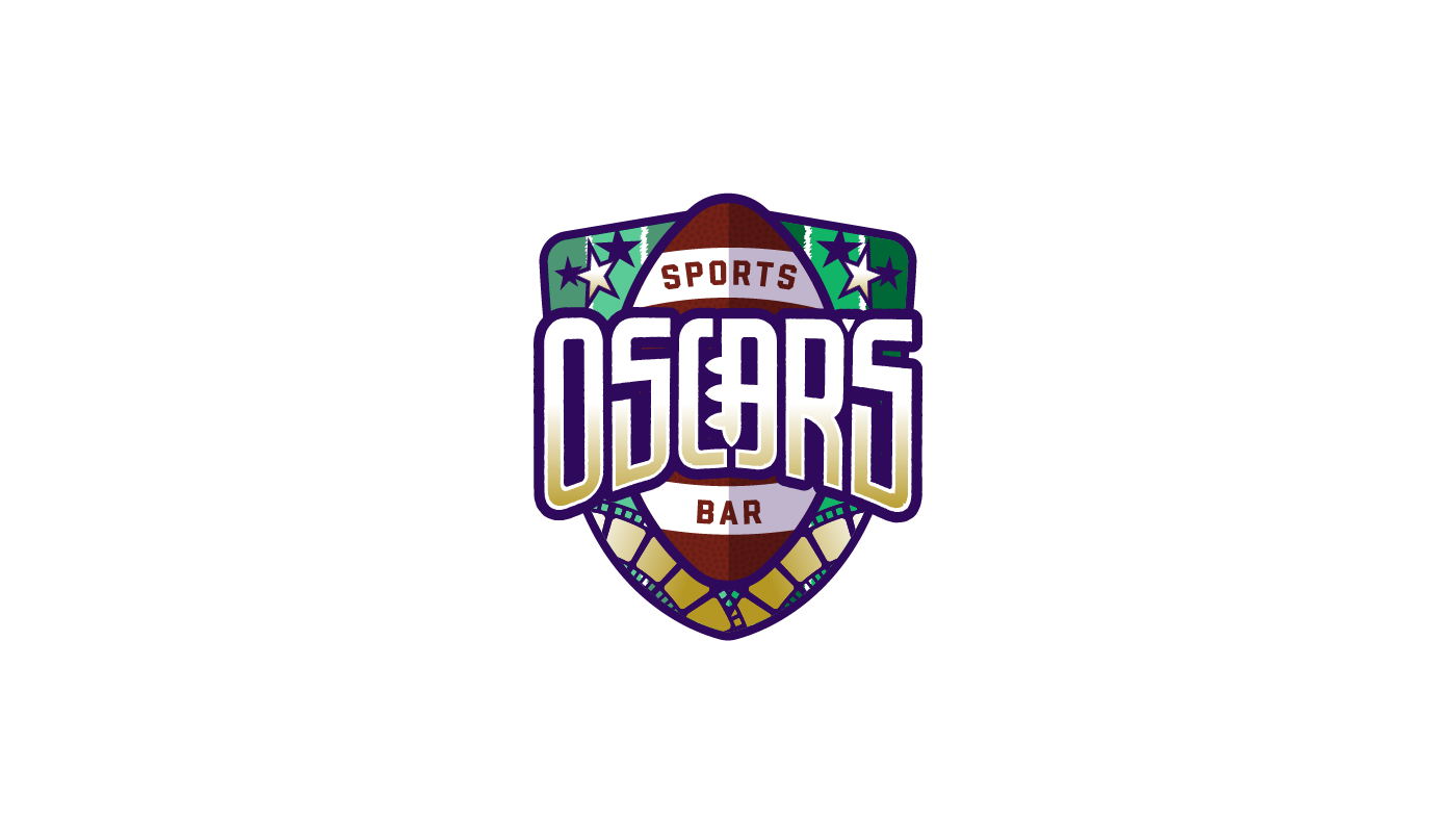
Client: Bill Warren – Oscar's Sports Bar Logo
As part of the launch of Warren Old Town Theater in Wichita, Bill Warren introduced Oscar’s—a unique sports bar concept integrated into the theater, with both in-theater service and separate street access. While working with Tony Blake, I led the design of the logo, creating a bold, versatile identity to support this innovative experience. Though not a full brand development, the Wichita location served as a test market, and this logo was a key first step in shaping a broader brand vision.
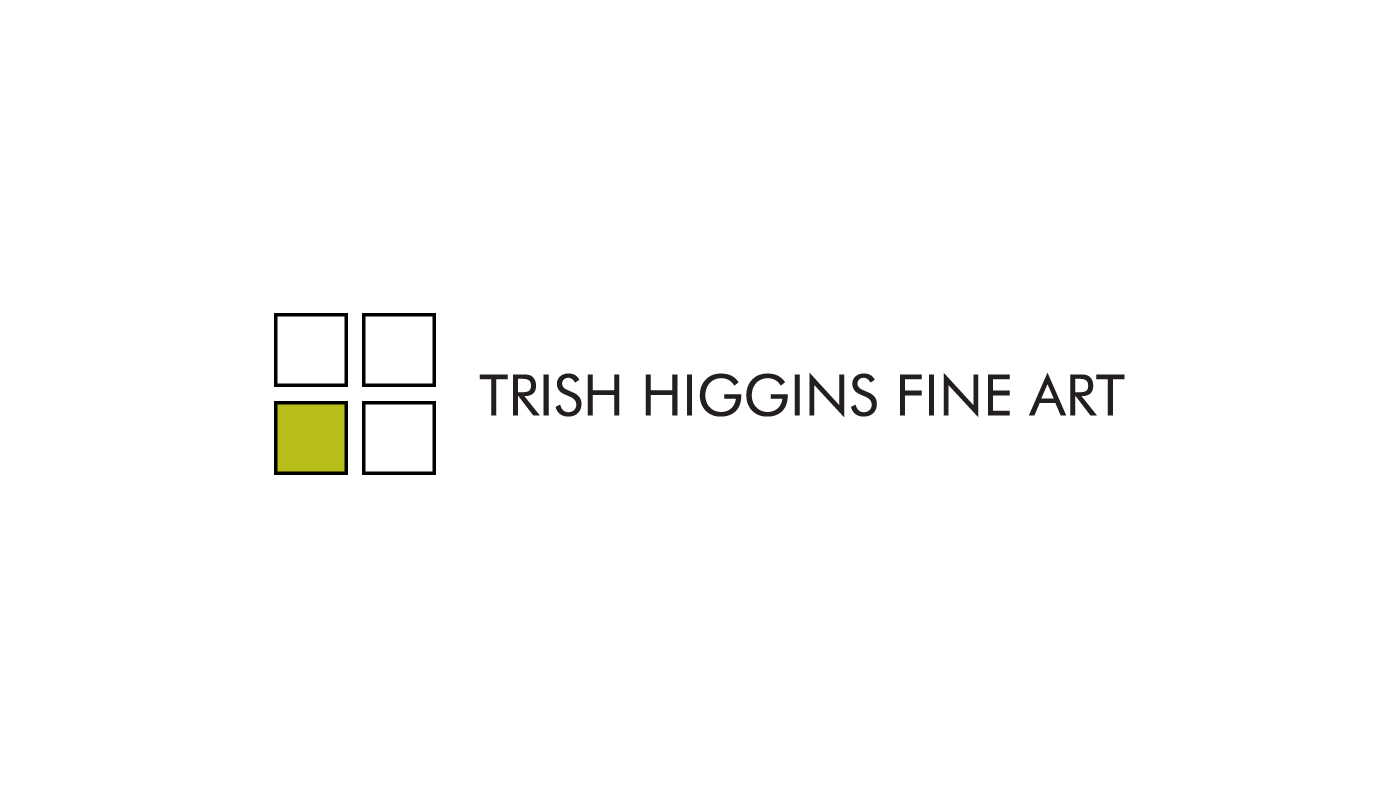
Client: Trish Higgins – Gallery Brand Identity
Trish Higgins Fine Art, located in Wichita’s historic Domestic Laundry Building, wanted a brand that reflected the character of its architectural surroundings. Drawing inspiration from the prairie-style green glass panes in the windows, I designed a clean, modern mark that subtly suggests four frames and the initials T, H, F, and A within the negative space. The result is a refined identity that mirrors the gallery’s aesthetic. This was a full-scope branding project, from concept to execution.
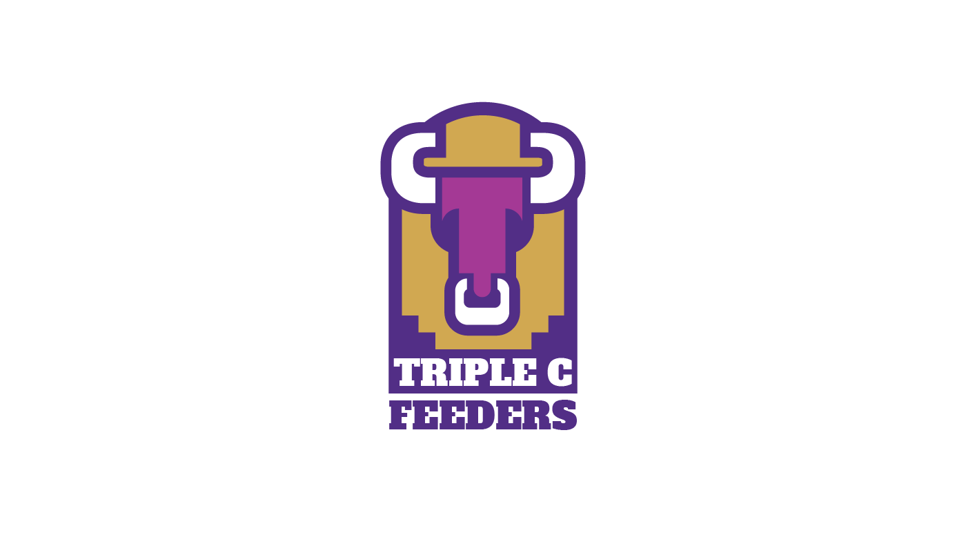
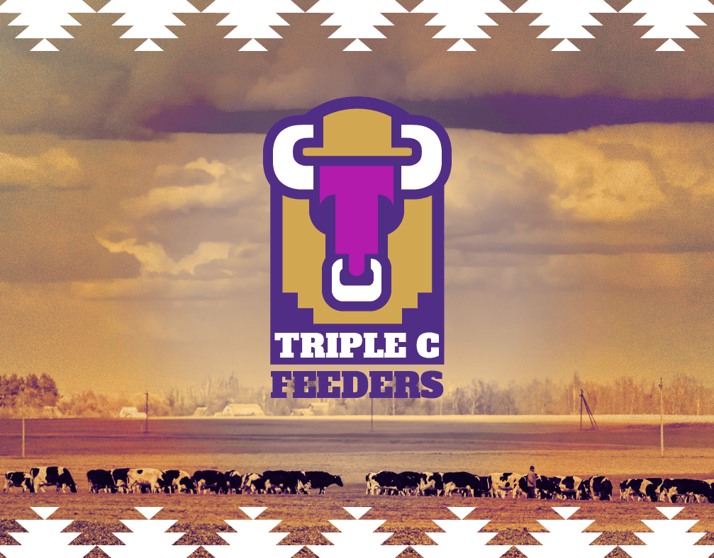
Client: Triple C Feeders – Brand Identity
Triple C Feeders, a family-run cattle feedlot in Rice County, Kansas, needed a distinct and unified brand to stand out in a competitive market. I developed a bold, versatile logo that merges the three Cs and a T into the stylized form of a bull’s head—symbolizing strength and family ownership. At the client’s request, Kansas State University purple was integrated into the design. This was a full brand development project, tailored for broad application across media.
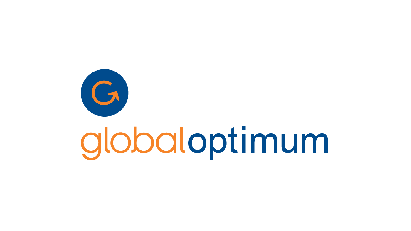
Client: Textron Aviation – Global Optimum Program Identity
While at Tony Blake Design, I led the identity design for Textron Aviation’s Global Optimum Program, part of the ProAdvantage suite. The program offers cost containment and added value through factory-direct service, parts, and support for aircraft owners. The final mark features a clean, minimal design aligned with Textron’s corporate brand system, ensuring consistency across its portfolio.
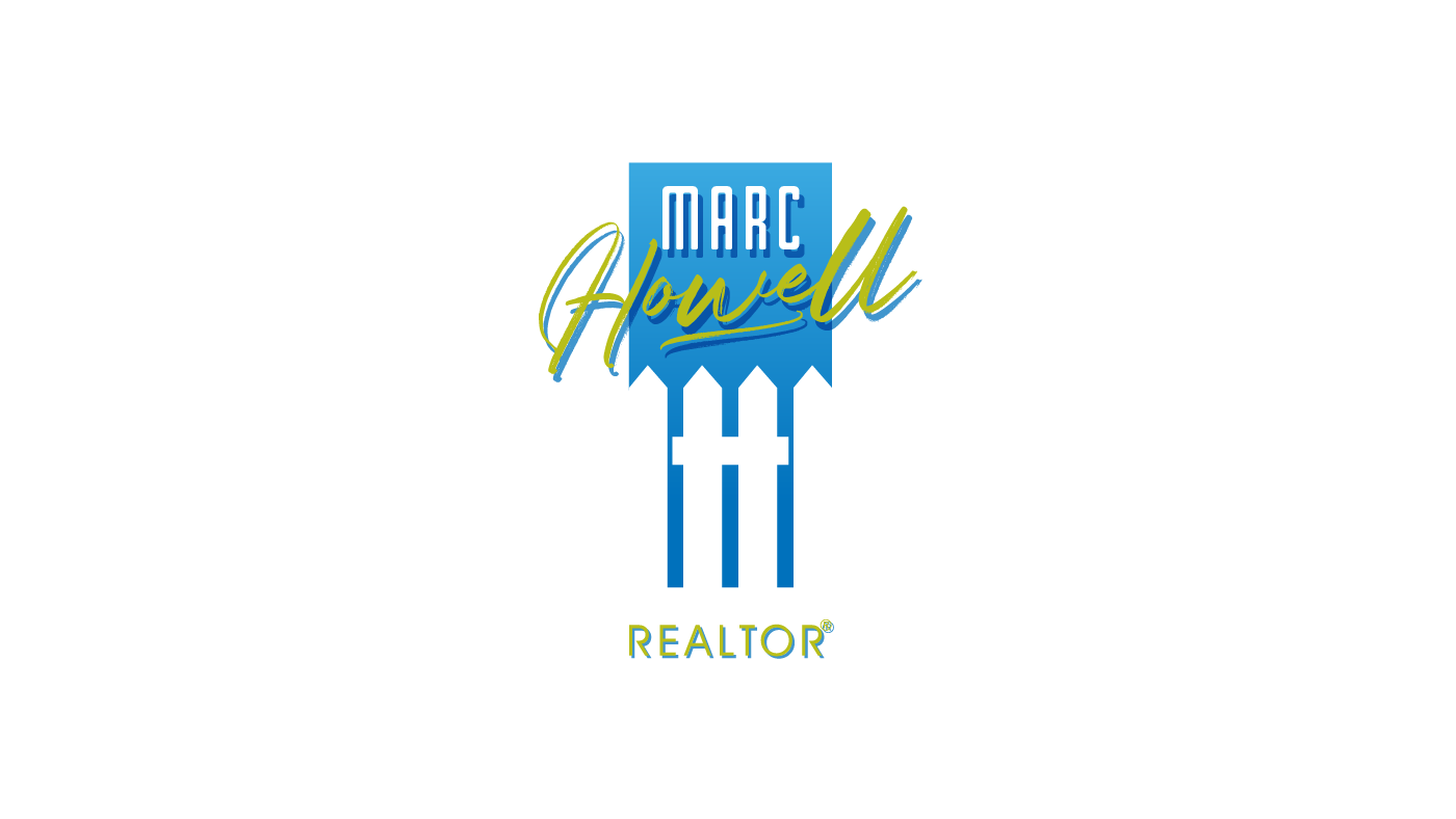
Client: Marc Howell – Brand Identity
Marc Howell, a residential real estate agent, investor, and home flipper, needed a versatile brand that could unify his varied business ventures. Drawing from the H in his last name and his focus on residential real estate, I integrated the letter into a stylized white picket fence—a classic symbol of home ownership. The result is a clean, memorable mark developed as part of a full brand identity system.
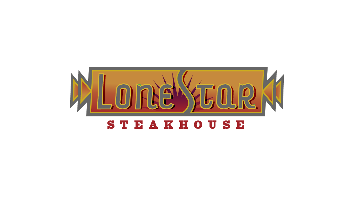
Client: Colter Enterprises – Lone Star Steakhouse Rebrand
While leading the design at Tony Blake Design, I worked with Colter Enterprises on a full rebrand of their Lone Star Steakhouse chain. The goal was to modernize the Western aesthetic while maintaining regional authenticity. My concept—though not selected—was a bold, Texas-inspired design featuring reds and golds to evoke both the geographic heat and the fire of the grill. Emphasizing “Lone Star” over “Steakhouse,” the branding reflected the chain’s evolving menu and broader identity.

Client: Iven Kelly – Brand Identity
For the launch of his upscale floral and gift boutique in Wichita, Iven Kelly envisioned a natural, earthy brand rooted in army green and copper tones. This design—approved instantly—captured that vision with organic elegance. We built a complete brand identity around those two core colors, creating a distinctive and cohesive visual presence that reflected the store’s refined, grounded aesthetic.
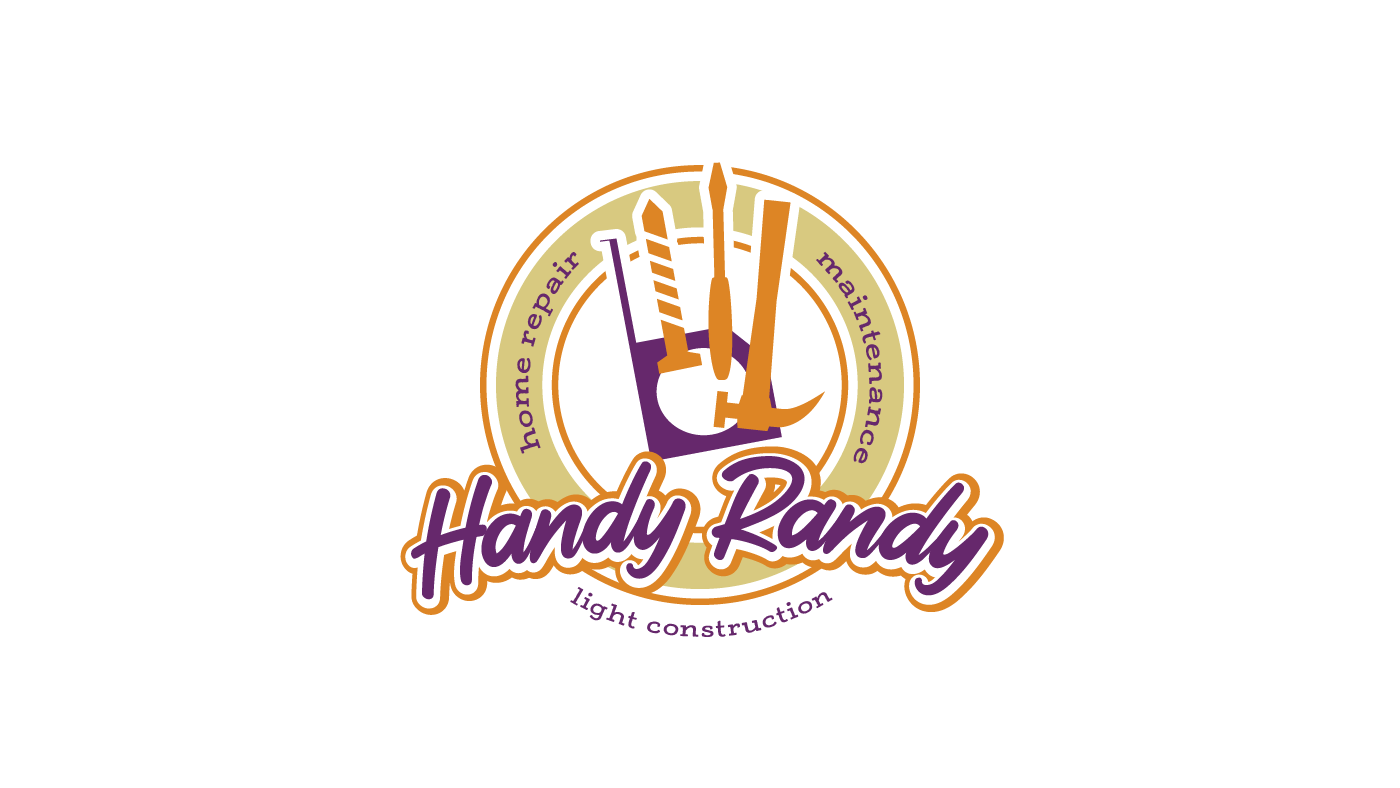
Client: Randall Dixon – Handy Randy Handyman Services Brand Identity
Handy Randy, a father-and-son handyman business, needed a brand that balanced playful naming with professional appeal. I developed a flexible logo system suitable for everything from business cards and t-shirts to vehicle signage and digital invoices. Inspired by the bold orange of my grandfather’s construction company, the design is approachable, memorable, and adaptable—easily reduced to one or two colors for cost-effective applications.
Client: Waterfront Developments – Naming & Brand Identity
While leading the project at Tony Blake Design, I developed both the name and visual identity options for a high-end commercial and residential development in East Wichita. One of my favorite proposed concepts featured an abstract fountain mark—symbolizing the centerpiece of the property—and a refined palette of orange, green, black, and warm earth tones inspired by sandstone, limestone, and iron. Though this direction was not ultimately selected, it reflected the upscale, modern character of the development.
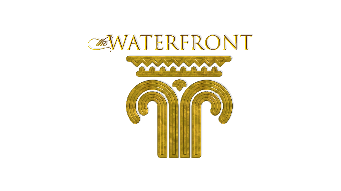
Client: Waterfront Developments - Alternate Brand Identity
This alternate identity concept for the Waterfront development explores a different name while maintaining the project’s upscale positioning. The logo features an abstract fountain that incorporates classical architectural elements—ionic scrolls and an egg-and-dart capital—subtly forming a series of gabled rooflines in the negative space. Rendered in a refined gold tone, the mark evokes sophistication and timeless elegance, aligning with the development’s high-end commercial and residential vision.